Moo & Taste
Artisanal Australian Farmers Ice-cream
A blend of quirky & premium
DELIVERABLES
Brand Strategy competitor research for a long-lasting brand to stand out and sell.
Full Visual Identity for print and digital
Full Packaging Design
Full Brand Guidelines
Brand Launch Guide
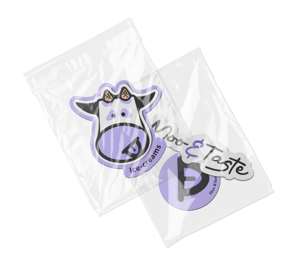
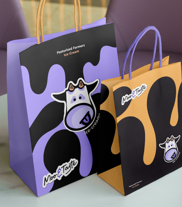
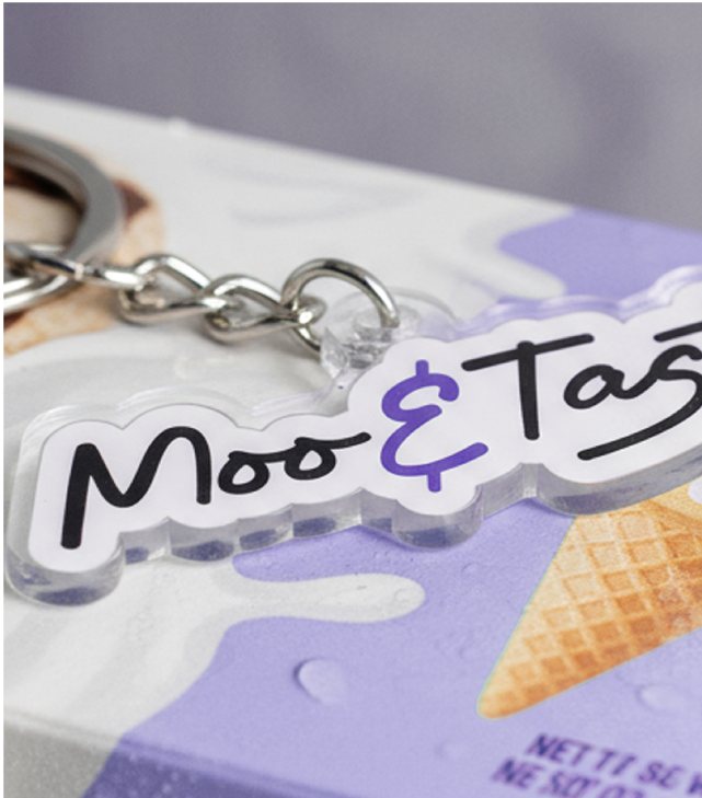
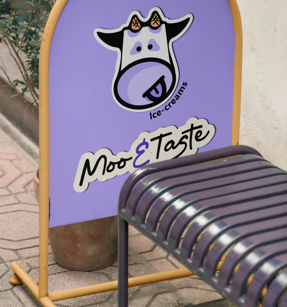
Merch and Stickers
Animated Logo
TIME-LINE : 4 WEEKS
CHALLENGE AND GOALS
Moo & Taste is an local farmers Ice-cream brand I worked on for 4 weeks, I wanted to explore how a fun mascot and clear concept could create emotion, story and a genuine connection with the target customer. Ellie from Moo & Taste came to me needing a full brand identity system for her new Australian Ice-cream Brand. The branding had to deliver a premium, sustainable and playful feel for the brand that showed off the local farmers produce while attracting world-wide customers to local stockists.
The challenge was to show that something delicious but not reinvented, can fit naturally into everyday life and be the “I NEED THAT” moment on shelves.
THE STORY
Every aspect of the design ties back to the core concept of fun yet healthy local indulgence. This shows up first in the cow mascot, where smooth forms that reflect ice-cream meet clean ingredients yet exciting flavours.
Designed with the intention of blending fun personality and farmers culture with vivid, bold design. The brand design itself was inspired by my hometown in France where the cows roam free and delicious local Farmers market produce is consumed generously.
The Concept
From the very beginning, we knew Moo & Taste needed a mascot that felt warm, playful, and instantly connected to the product. The goal wasn’t just to design a cow it was to create a character that embodies fresh, handcrafted ice cream and the joy of farmers market culture.
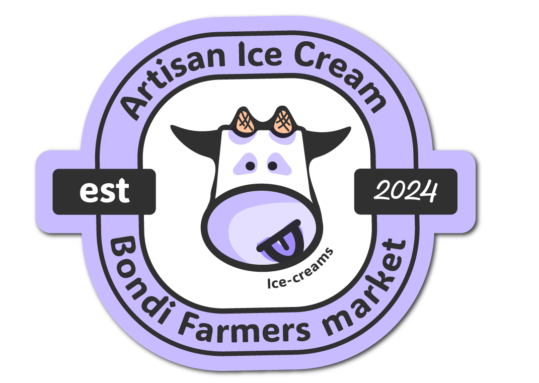
Logo mark breakdown
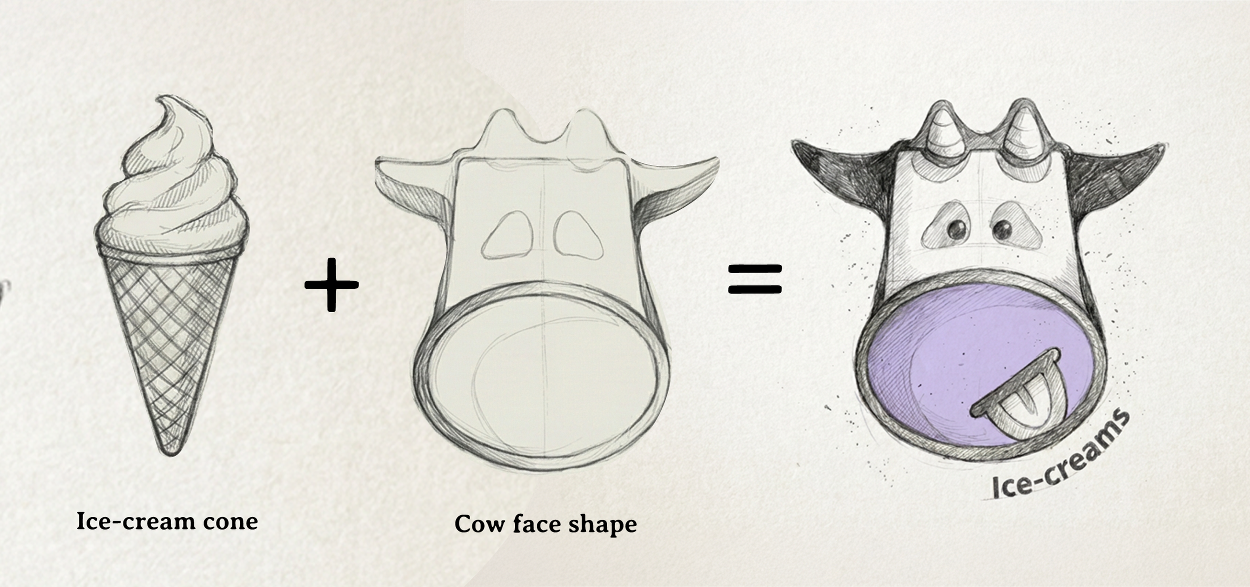

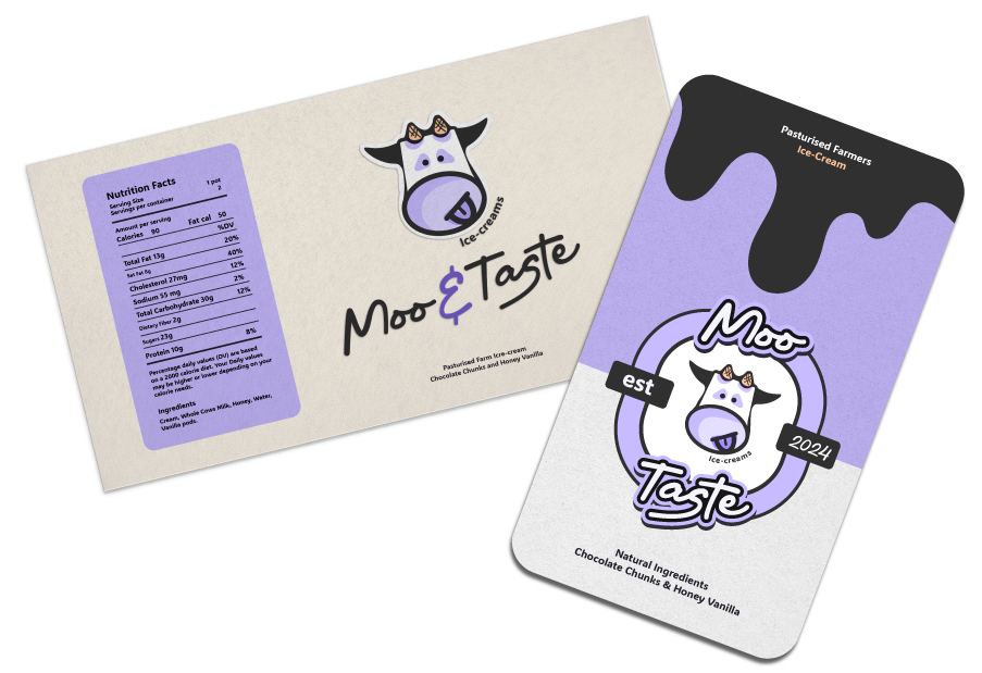
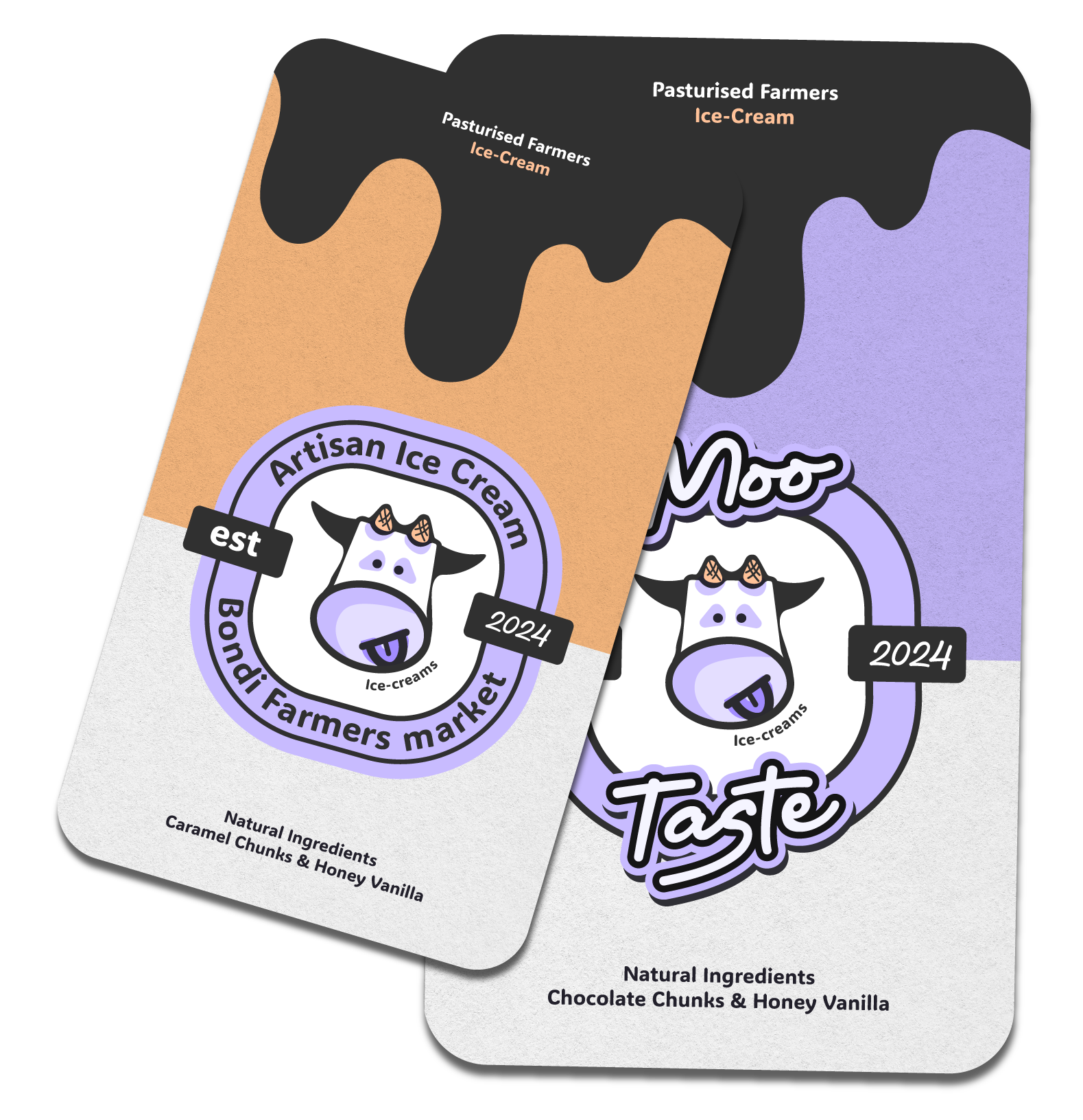
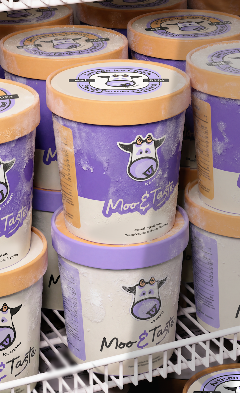
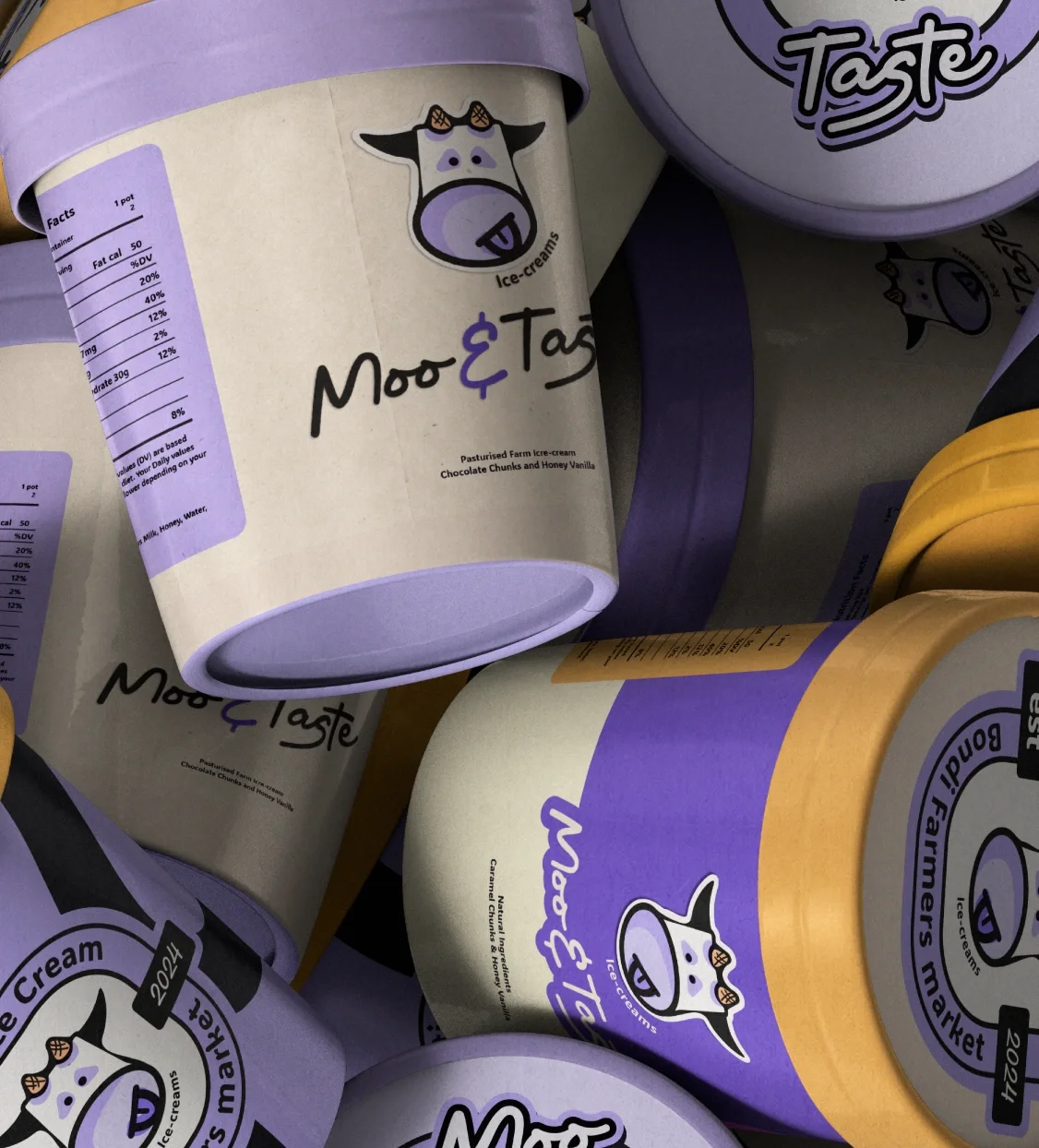
The concept was inspired by Australian meadow fields and slow, simple pleasures. The soft lavender tones reference open fields and calm summer evenings, while creamy whites mirror the richness of freshly pasteurised ice cream. To bring the product directly into the mark, the cow’s horns were reimagined as ice cream cones merging mascot and product into one memorable, own-able symbol.
By keeping the shapes rounded, friendly, and slightly imperfect, the logo feels approachable and nostalgic rather than corporate. The result is a mark that’s recognisable at a glance, playful without being childish, and rooted in the honest, feel-good values of Moo & Taste: fresh ingredients, local craft, and ice cream made to be enjoyed in the moment.
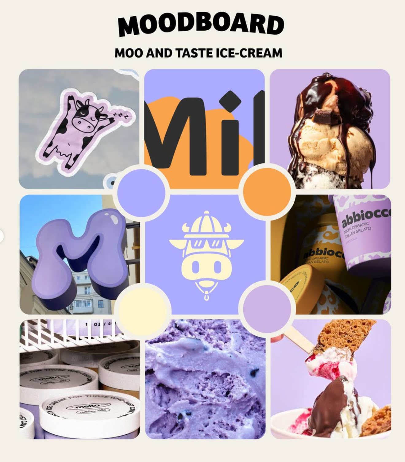
Moodboard :

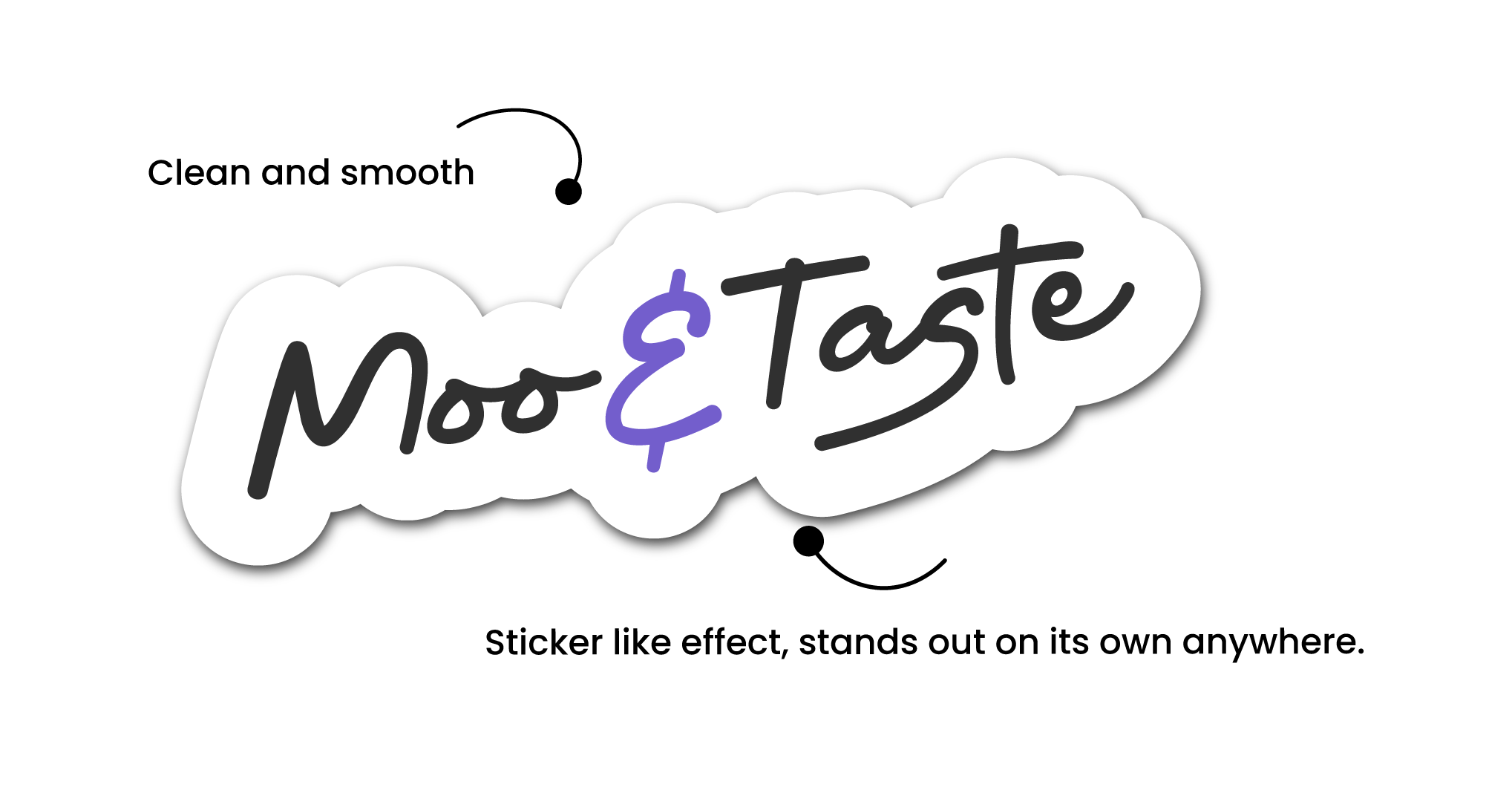
The Logo Suite
Typography & Colour palette

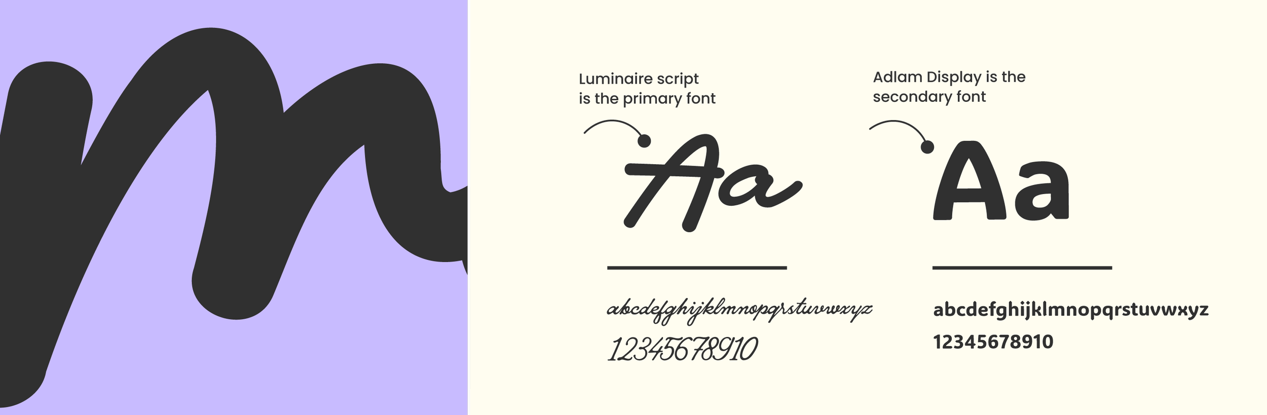
For the logotype I chose this beautiful picket fence typeface Adlam which marry's up the to the logo mark perfectly. The type had to exude this friendly, relaxed yet sophisticated feel to it. The brand had to have a slightly playful and nostalgic feel to it so by choosing this type with slightly rounded edges, it hit the mark right away. Paired with a playful cursive handwritten font to ad dimension to the brand and refer to the handmade artisan produce.
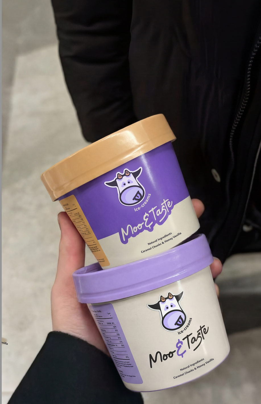
For the colour paletter a lavender purple to refer to the flowers in a wild farmers meadow, orange for the sun and warmth, and cream for the fresh artisan ice-cream !
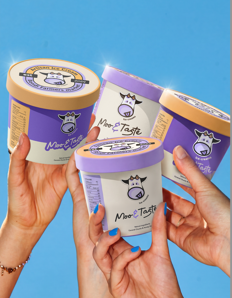
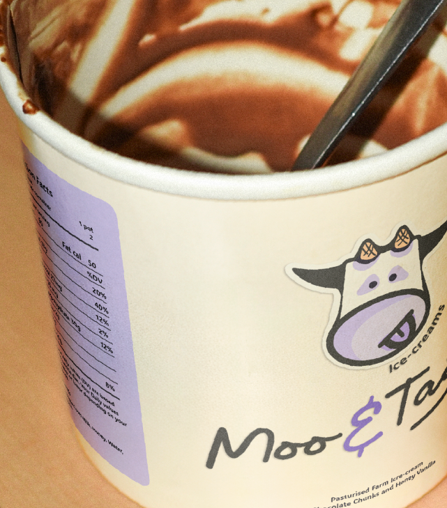
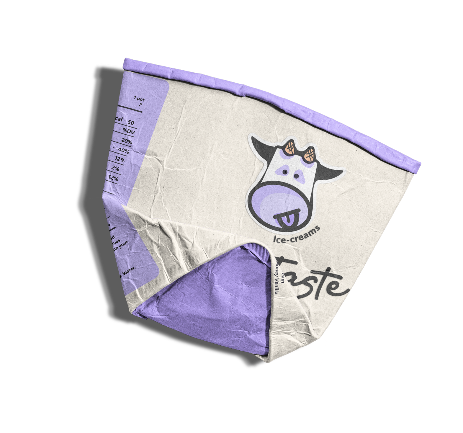
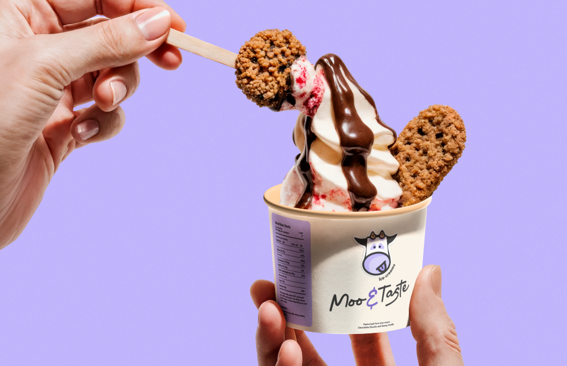
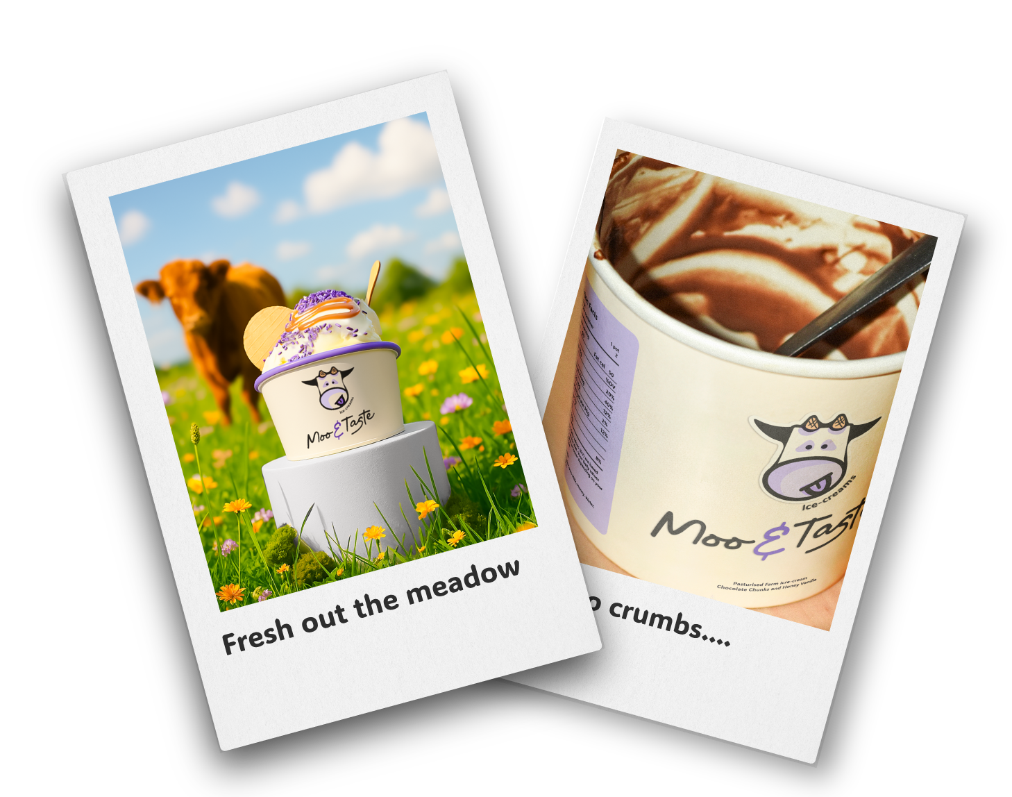
The Packaging